Aesthu Bits: The Evolution of a Brand Identity
Branding is more than just a logo—it’s the visual and emotional identity that connects people to a business. A brand’s journey is often reflected in its evolution, adapting to new audiences, trends, and visions. Aesthu Bits, originally a deeply personal and artistic venture, has undergone a transformation. This rebranding brings a fresh identity while staying true to its whimsical and heartfelt roots.
Let’s dive into the evolution of Aesthu Bits’ branding and explore what this new identity represents.
The Origins of Aesthu Bits: A Personal Touch

Aesthu Bits began as a creative passion project, a platform to blend art with thoughtful gifting. The original branding captured the essence of handmade charm and personal artistry. The first logo was an illustrated portrait of a relaxed, seated figure, paired with a playful, wavy font. It exuded a warm, artistic, and handcrafted feel.
What the Old Logo Represented:
- Artistic Expression: The hand-drawn elements reflected the artistic, custom nature of Aesthu Bits.
- Personal Connection: Featuring an illustrated figure made the brand feel deeply personal, as if every product carried a piece of the creator’s essence.
- Whimsical and Quirky: The playful typography and organic design communicated a free-spirited and fun-loving brand.
While charming and unique, the old logo had some limitations:
- Scalability Issues: The intricate illustration made it difficult to resize for various branding materials.
- Lack of Clarity: The artistic elements, while beautiful, did not clearly communicate what the brand was about at first glance.
- Limited Versatility: The highly stylized design made it harder to adapt for future branding needs, such as packaging, digital marketing, and professional expansion.
Recognizing these challenges, Aesthu Bits set out to refine its identity, keeping the essence alive while making the brand more cohesive and scalable.
The New Logo: A More Refined Identity
With growth comes transformation, and the new Aesthu Bits branding represents a step towards a more structured yet equally expressive identity. The new design replaces the illustrated figure with a clean, modern logo that is visually striking, versatile, and instantly recognizable.
The new logo is a game-changer, literally and figuratively. Designed to resemble a gift box, it instantly conveys the essence of Aesthu Bits—personalized, thoughtful gifting and curated creative products.
Key Changes in the New Branding:
1. Typography: Clear and Bold
The new logo features a clean, sans-serif typeface, making it easily readable and adaptable across platforms. The bold text enhances visibility and professionalism while still maintaining a playful edge.
Soft, Lowercase Typography: The decision to keep all letters lowercase makes the branding feel more approachable, warm, and welcoming rather than rigid or corporate.
2. Color Palette: A Balance of Playfulness and Sophistication
The new branding introduces a refined color palette, incorporating soft blues, bright yellow, and deep red. These colors create a harmonious balance:
- Blue: Evokes trust, reliability, and creativity.
- Yellow: Symbolizes warmth, happiness, and joy—perfect for a gifting brand.
- Red: Adds energy and passion, making the brand feel vibrant and alive.
3. Gift Box Motif: A Clearer Representation of the Brand’s Purpose
One of the standout elements of the new logo is the bow icon, reinforcing the concept of gifting. This small but significant addition immediately communicates what Aesthu Bits is about—thoughtful, creative, and unique gifts.
- The ‘a’ Standing Out: The lowercase “a” extending beyond the box symbolizes thinking outside the box, reflecting the brand’s innovative and unique approach.
4. Brand Board: A Unified and Cohesive Visual Identity
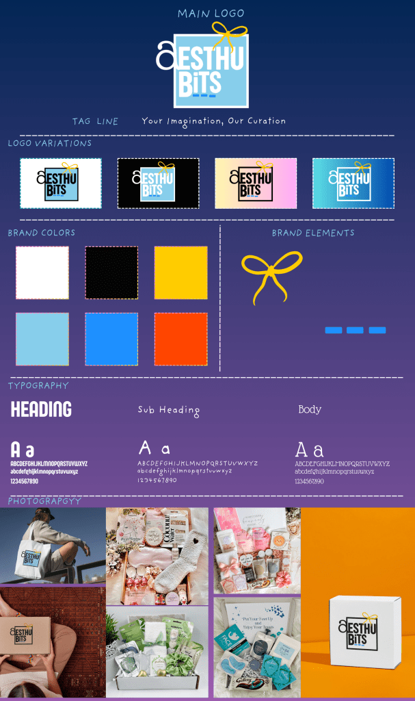
Alongside the new logo, Aesthu Bits now has a comprehensive brand board, which includes:
- Defined typography for headers, subheaders, and body text
- A structured color palette for consistency
- Logo variations for different backgrounds and uses
- A cohesive design system to ensure a unified look across all branding materials
This new approach makes Aesthu Bits visually stronger and more adaptable for various applications, from packaging to social media and beyond.
Which One Works Better?
Both logos have their strengths, but in terms of branding and business growth, the new logo is a significant upgrade.
Pros of the Old Logo:
✔ Unique and personal touch
✔ Strong artistic identity
✔ Whimsical and warm feel
Cons of the Old Logo:
✘ Difficult to scale for branding needs
✘ Lacked clear communication about the brand’s purpose
✘ Less professional for business expansion
Pros of the New Logo:
✔ Clear, modern, and readable typography
✔ Instantly communicates the brand’s purpose
✔ Adaptable for various branding materials
✔ Professional yet fun, balancing playfulness with growth
The new branding allows Aesthu Bits to maintain its artistic core while making it more practical for future expansion.
Final Thoughts: Branding as a Journey
A brand’s visual identity should evolve alongside its vision. The new Aesthu Bits branding reflects growth, clarity, and an improved storytelling approach without losing its whimsical roots.
This transformation is an example of how businesses can refine their aesthetics while staying true to their core values. With a polished, cohesive identity, Aesthu Bits is now better equipped to share its creativity with the world, ensuring a lasting impression on customers and followers alike.
As Aesthu Bits continues to grow, this new branding lays the foundation for exciting new opportunities and creative adventures ahead!
